R for Epidemiology
Contents
These are my notes from reading parts of the book R for Epidemiology.
Descriptive analysis
Descriptive analysis is sometimes called Exploratory analysis.
Descriptive statistics is often a good starting point.
There are at least three reasons why we want to start with a descriptive analysis:
- We can use descriptive analysis to uncover errors in our data.
- It helps us understand the distribution of values in our variables.
- Descriptive analysis serve as a starting point for understanding relationships between our variables.
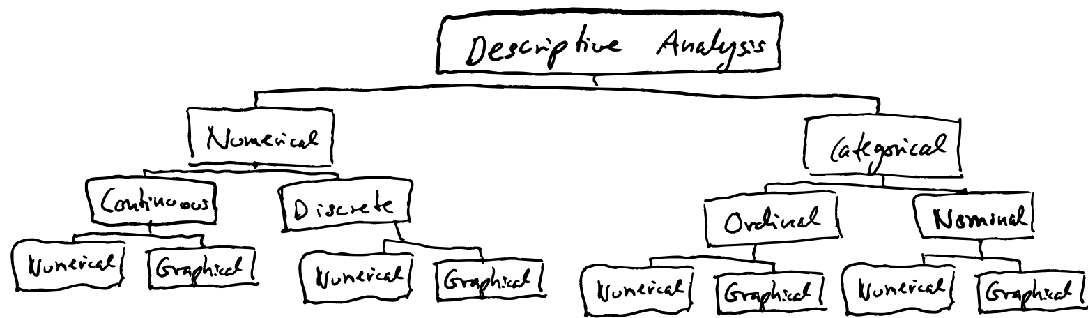
Variables can be numerical or categorical.
- Numeric variables can be continuous or discrete.
- Categorical variables can be ordinal (oridinalnivå in Norwegian) or nominal (nominalnivå). Ordinal variables can be sorted/ordered and classified (e.g. low, medium, high), while nominal variables can only be classified (e.g. man or woman).
All types of variables can be analysed with either numerical or graphical methods.
Categorical data
Factors in R
Factors are useful when operating on categorical data. Often you don’t want to have categories as characters in R. E.g. because R summarizes characters alphabetically by default. It’s easier to determine the order of factors. With factors it’s also possible to specify cases that are not in our data (not observed).
Coercing variables into factors
The code below shows one method for coercing a numeric vector into a factor.
# Load dplyr for tibble(), pipe and mutate()
library(dplyr)

demo <- tibble(
  id       = c("001", "002", "003", "004"),
  age      = c(30, 67, 52, 56),
  edu      = c(3, 1, 4, 2),
  edu_char = c(
    "Some college", "Less than high school", "College graduate",
    "High school graduate"
  )
)
Using mutate() to add a factor column.
demo <- demo %>%
  mutate(
    edu_f = factor(
      x      = edu,
      levels = 1:4,
      labels = c(
        "Less than high school", "High school graduate", "Some college",
        "College graduate"
      )
    )
  )
demo
# A tibble: 4 × 5
  id      age   edu edu_char              edu_f
  <chr> <dbl> <dbl> <chr>                 <fct>
1 001      30     3 Some college          Some college
2 002      67     1 Less than high school Less than high school
3 003      52     4 College graduate      College graduate
4 004      56     2 High school graduate  High school graduate
Here we create a new column with the factors instead of overwriting the original edu column. That is often wise in order to keep the numeric version of the data for reference. Here they also use _f as a naming convention for factors.
To create a vector of factors we use the factor() function. And we pass the numerial vector edu to the x argument of factor(). So we kind of map the different factors to elements in the numeric vector (but these are mapped via levels I think…). And then we also need to specify the levels. levels tells R the unique values that the new factor variable can take. labels are descriptive text assigned to each value in the levels argument. The order of the labels in the character vector we pass to the labels argument should match the order of the values passed to the levels argument. For example, the ordering of levels and labels above tells R that 1 should be labeled with “Less than high school,” 2 should be labeled with “High school graduate,” etc.
Even though the factors look just like the character vector when they are printed, they are actually integers under the hood.
as.numeric(demo$edu_char)
## Warning: NAs introduced by coercion
## [1] NA NA NA NA

as.numeric(demo$edu_f)
## [1] 3 1 4 2
Factors allows us to have unobserved values in our data:
demo <- demo %>%
  mutate(
    edu_5cat_f = factor(
      x      = edu,
      levels = 1:5,
      labels = c(
        "Less than high school", "High school graduate", "Some college",
        "College graduate", "Graduate school"
      )
    )
  )

table(demo$edu_5cat_f)

Less than high school  High school graduate          Some college
                    1                     1                     1
     College graduate       Graduate school
                    1                     0
We can also coerce a character vector into factors:
demo <- demo %>%
  mutate(
    edu_f_from_char = factor(
      x      = edu_char,
      levels = c(
        "Less than high school", "High school graduate", "Some college",
        "College graduate", "Graduate school"
      )
    )
  )
Here, because the levels already are character strings, we don’t need to add any labels argument. Keep in mind, though, that the order of the values passed to the levels argument matters. It will be the order that the factor levels will be displayed in your analyses.
Create Height and Weight Data
library(dplyr)
# Simulate some data
height_and_weight_20 <- tibble(
  id = c(
    "001", "002", "003", "004", "005", "006", "007", "008", "009", "010", "011",
    "012", "013", "014", "015", "016", "017", "018", "019", "020"
  ),
  sex = c(1, 1, 2, 2, 1, 1, 2, 1, 2, 1, 1, 2, 2, 2, 1, 2, 2, 2, 2, 2),
  sex_f = factor(sex, 1:2, c("Male", "Female")),
  ht_in = c(
    71, 69, 64, 65, 73, 69, 68, 73, 71, 66, 71, 69, 66, 68, 75, 69, 66, 65, 65,
    65
  ),
  wt_lbs = c(
    190, 176, 130, 154, 173, 182, 140, 185, 157, 155, 213, 151, 147, 196, 212,
    190, 194, 176, 176, 102
  )
)
Calculating frequencies
The first thing we want to do is to generate some summary statistics. The summarise() function is useful for this. We can use another function, n(), inside summarise() to count rows. By default, it will count all the rows in the data frame (there are 20 rows):
height_and_weight_20 %>%
  summarise(n())

## # A tibble: 1 × 1
##   `n()`
##   <int>
## 1    20
The output is a new data frame.
Now we want to count how many rows have the value Female and Male in the sex_f column. Then first group the data using group_by():
height_and_weight_20 %>%
  group_by(sex_f) %>%
  summarise(n())

## # A tibble: 2 × 2
##   sex_f  `n()`
##   <fct>  <int>
## 1 Male       8
## 2 Female    12
Using the n() function along will create a column with the counts called n(). Name the count column like this:
height_and_weight_20 %>%
  group_by(sex_f) %>%
  summarise(n = n())
Actually, grouping and counting can be done in a single step using the count() function (the add_count() function will add the counts as a new column of the original data frame instead of creating a new data frame):
height_and_weight_20 %>%
  count(sex_f)

## # A tibble: 2 × 2
##   sex_f      n
##   <fct>  <int>
## 1 Male       8
## 2 Female    12
Calculating percentages
Because the count() function produces a data frame (or a tibble) we can pipe the output into other functions, like mutate():
height_and_weight_20 %>%
  count(sex_f) %>%
  mutate(prop = n / sum(n))

## # A tibble: 2 × 3
##   sex_f      n  prop
##   <fct>  <int> <dbl>
## 1 Male       8   0.4
## 2 Female    12   0.6
```r
The `count()` function produces a column named `n`. And here we create a new column with n divided by the sum of all numbers in the n column.

To calculate the percentage:
```r
height_and_weight_20 %>%
  count(sex_f) %>%
  mutate(percent = n / sum(n) * 100)

## # A tibble: 2 × 3
##   sex_f      n percent
##   <fct>  <int>   <dbl>
## 1 Male       8      40
## 2 Female    12      60
Missing data
Let’s replace some values in sex_f with NA:
height_and_weight_20 <- height_and_weight_20 %>%
  mutate(sex_f = replace(sex, c(2, 9), NA)) %>%
  print()
## # A tibble: 20 × 5
##    id      sex sex_f ht_in wt_lbs
##    <chr> <dbl> <dbl> <dbl>  <dbl>
##  1 001       1     1    71    190
##  2 002       1    NA    69    176
##  3 003       2     2    64    130
##  4 004       2     2    65    154
##  5 005       1     1    73    173
##  6 006       1     1    69    182
##  7 007       2     2    68    140
##  8 008       1     1    73    185
##  9 009       2    NA    71    157
## 10 010       1     1    66    155
## 11 011       1     1    71    213
## 12 012       2     2    69    151
## 13 013       2     2    66    147
## 14 014       2     2    68    196
## 15 015       1     1    75    212
## 16 016       2     2    69    190
## 17 017       2     2    66    194
## 18 018       2     2    65    176
## 19 019       2     2    65    176
## 20 020       2     2    65    102
If we summarise and calculate the frequencies and precentages like above, the missing values are treated as a category of sex_f. Sometimes that is ok, and it’s a nice way of displaying the data.
height_and_weight_20 %>%
  count(sex_f) %>%
  mutate(percent = n / sum(n) * 100)

## # A tibble: 3 × 3
##   sex_f     n percent
##   <dbl> <int>   <dbl>
## 1     1     7      35
## 2     2    11      55
## 3    NA     2      10
If we want to do the calculations on only non-missing data (also known as complete case analysis) we can for example filter out the rows with missing values for sex_f first (note that many R functions often have the argument na.rm that can be used to drop NAs):
height_and_weight_20 %>%
  filter(!is.na(sex_f)) %>%
  count(sex_f) %>%
  mutate(percent = n / sum(n) * 100)

## # A tibble: 2 × 3
##   sex_f     n percent
##   <dbl> <int>   <dbl>
## 1     1     7    38.9
## 2     2    11    61.1
Numerical variables
We’re working with numerical variables this time.
Central tendency - trying to describe what is typical. We’re looking at three measures of central tendency here:
- The mean
- The median
- The mode
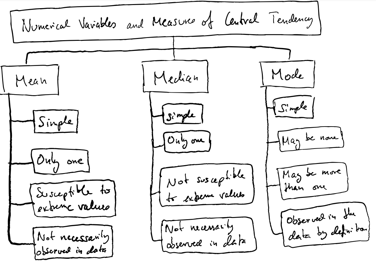
The mean Arithmetic mean is the sum of a collection of numbers/values divided by the number of values. The arithmetic mean is what we often refer to when we talk about the mean.
The arithmetic mean is vulnerable to outliers and extreme values, and also when the distributions are skewed. Also remember that the arithmetic mean does not necessarily have to be a number that is actually part of the data.
The Median
If you have an odd number of observations, the median is the same as the middle number when they are ordered. However, when there’s and even number then the median is the mean of the two middle numbers. Hence, the median is not always observed in the data. Just like for the mean.
The Mode The mode is the value most often observed in our data. This means there can be more than one mode, or there can be no mode at all if all values are equally frequent. And the mode is, by definition, always observed in our data.
To calculate the mean and median in R we can just use the built-in mean() and median(). However, there’s no predefined mode function (the mode() function in base R does something else, it shows what kind of object we have). This is one example of calculating the mode:
library(dplyr)

# Simulate some data
  height_and_weight_20 <- tribble(
    ~id,   ~sex,     ~ht_in, ~wt_lbs,
    "001", "Male",   71,     190,
    "002", "Male",   69,     177,
    "003", "Female", 64,     130,
    "004", "Female", 65,     153,
    "005", NA,       73,     173,
    "006", "Male",   69,     182,
    "007", "Female", 68,     186,
    "008", NA,       73,     185,
    "009", "Female", 71,     157,
    "010", "Male",   66,     155,
    "011", "Male",   71,     213,
    "012", "Female", 69,     151,
    "013", "Female", 66,     147,
    "014", "Female", 68,     196,
    "015", "Male",   75,     212,
    "016", "Female", 69,     19000,
    "017", "Female", 66,     194,
    "018", "Female", 65,     176,
    "019", "Female", 65,     176,
    "020", "Female", 65,     102
  )
mode_val <- function(x) {

  # Count the number of occurrences for each value of x
  value_counts <- table(x)

  # Get the maximum number of times any value is observed
  max_count <- max(value_counts)

  # Create an index vector that identifies the positions that correspond to
  # count values that are the same as the maximum count value: TRUE if so
  # and false otherwise
  index <- value_counts == max_count
  # Looks something like this:
  #   64    65    66    68    69    71    73    75
  # FALSE  TRUE FALSE FALSE  TRUE FALSE FALSE FALSE

  # Use the index vector to get all values that are observed the same number
  # of times as the maximum number of times that any value is observed
  unique_values <- names(value_counts)
  result <- unique_values[index]
  # This subsets the index vector and retrieves the names of the vector that are TRUE

  # If result is the same length as value counts that means that every value
  # occured the same number of times. If every value occurred the same number
  # of times, then there is no mode
  no_mode <- length(value_counts) == length(result)
  # I guess we could have also used unique_values instead of value_counts

  # If there is no mode then change the value of result to NA
  if (no_mode) {
    result <- NA
  }
  # The if statement is only executed if no_mode is TRUE. So the object no_mode can exists, but the if statement will not be run if the object is FALSE.

  # Return result
  result
}
mode_val(height_and_weight_20$ht_in)
## [1] "65" "69"
Comparison
Here’s a nice example of using the summarise() function to create new columns with different descriptive statistics. Notice how several new columns can be created in a single summarise function. These will all be present in the new tibble.
This is also a nice way to quickly inspect the data. To see the minimum and maximum values. And the comparison of the mean and median, in relation to the min and max values gives an indication that there could be outliers in the data.
height_and_weight_20 %>%
  summarise(
    min_weight    = min(wt_lbs),
    mean_weight   = mean(wt_lbs),
    median_weight = median(wt_lbs),
    mode_weight   = mode_val(wt_lbs) %>% as.double(),
    max_weight    = max(wt_lbs)
  )
## # A tibble: 1 × 5
##   min_weight mean_weight median_weight mode_weight max_weight
##        <dbl>       <dbl>         <dbl>       <dbl>      <dbl>
## 1        102       1113.          176.         176      19000
We’re interested in describing what is “typical”, or “average” in our data. Last time we looked at measures like “mean”, “median” and “mode”. Now we want to look into things like, “how much like the average person, are the other people in our data set”. Are everyone average? Is average the middle value of everyone else’s? If we look at the heights in this dataset:
library(tidyverse)

# Simulate some data
height_and_weight_20 <- tribble(
  ~id,   ~sex,     ~ht_in, ~wt_lbs,
  "001", "Male",   71,     190,
  "002", "Male",   69,     177,
  "003", "Female", 64,     130,
  "004", "Female", 65,     153,
  "005", NA,       73,     173,
  "006", "Male",   69,     182,
  "007", "Female", 68,     186,
  "008", NA,       73,     185,
  "009", "Female", 71,     157,
  "010", "Male",   66,     155,
  "011", "Male",   71,     213,
  "012", "Female", 69,     151,
  "013", "Female", 66,     147,
  "014", "Female", 68,     196,
  "015", "Male",   75,     212,
  "016", "Female", 69,     19000,
  "017", "Female", 66,     194,
  "018", "Female", 65,     176,
  "019", "Female", 65,     176,
  "020", "Female", 65,     102
)

# Recreate our mode function
mode_val <- function(x) {
  value_counts <- table(x)
  result <- names(value_counts)[value_counts == max(value_counts)]
  if (length(value_counts) == length(result)) {
    result <- NA
  }
  result
}

height_and_weight_20 %>%
  summarise(
    min_height    = min(ht_in),
    mean_height   = mean(ht_in),
    median_height = median(ht_in),
    mode_height   = mode_val(ht_in) %>% paste(collapse = " , "),
    max_height    = max(ht_in)
  )
## # A tibble: 1 × 5
##   min_height mean_height median_height mode_height max_height
##        <dbl>       <dbl>         <dbl> <chr>            <dbl>
## 1         64        68.4          68.5 65 , 69             75
Remember that the mean or the median does not have to be an actual value, or observation, in the data. So therefore, we might want to investigate things like, how much like the average person are the other people in the dataset? Are all persons the same height? Is the average the middle value, or is the distribution skewed?
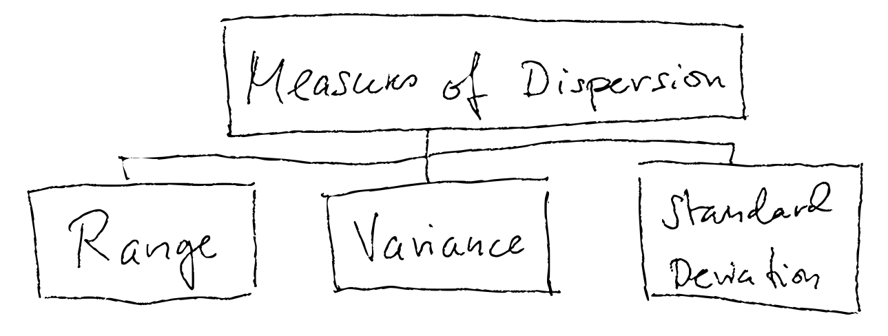
This is called to investigate the dispersion (spredning tenker jeg?), and there are three common measures of dispersion:
- Range
- Variance
- Standard Deviation
Range
The range is the difference between the minimum and maximum value.
In our dataset the range is 11.
height_and_weight_20 %>%
  summarise(
    min_height  = min(ht_in),
    mean_height = mean(ht_in),
    max_height  = max(ht_in),
    range       = max_height - min_height
  )
## # A tibble: 1 × 4
##   min_height mean_height max_height range
##        <dbl>       <dbl>      <dbl> <dbl>
## 1         64        68.4         75    11
The range is often useful, but it doesn’t tell anything about the distribution. Are most people located on either end of the range, or in the middle, or evenly distributed?
Variance
Variance measures the variability from the average or the mean. You take the difference of each observation in the data set from the mean, squaring the differences (to get positive values), and dividing the sum of these differences to the mean by the number of observations in the data set. In this way, the variance takes into account the spread of all the data points in the data set.
The variance of a sample is often denoted
In R, the function var() can calculate the variance.
Standard Deviation
The square root of the variance is the standard deviation (SD). The sample standard deviation is denoted , while the population standard deviation is denoted
.
Standard deviation of a sample:
So in this case, the variance is 120 and the standard deviation is which is 10.95 inches (notice the original units).
What is the standard deviation? The standard deviation is similar to the variance, however as the variance is in squared units it isn’t that intuitive. Because standard deviation takes the root of the variance we get the original units. Hence, the standard deviation is more easy to compare against the original numbers, and to other samples. A low standard deviation indicates that the values of the samples are close to the mean, while a high standard deviation indicates a more spread distribution.
If the values in our sample are normally distributed, then the percentage of values within each standard deviation from the mean follow these rules:
| Standard deviations | Percent of values |
|---|---|
| 1 | 68% |
| 2 | 95% |
| 3 | 99% |
In other words, when we know that the mean of our sample is 68.4 inches, and the standard deviation is 10.95 inches we know that 68% of all the students are between 57.45-79.35 inches (1 SD lower and higher than the mean).
In R we can generate normally distributed data with a given mean and a given standard deviation using the rnorm function (this creates random numbers with a given mean and SD):
rnorm(n=20, mean=68.4, sd=10.05))

 [1] 63.69113 68.89975 84.73759 56.37946 67.44818 63.19714
 [7] 80.50921 58.63412 47.03020 72.54318 74.93411 91.41247
[13] 60.29886 63.09570 54.25223 83.97762 69.61411 74.98939
[19] 65.16676 83.72266
Comparing distributions
The standard deviation and the variance is not always intuitive and immediately easy to interpret. It is often useful to compare them. T he variance if often largen when the values are clustered at either end of the range, i.e. far away from the mean.
Bivariate analysis
Univariate analysis is when analysing or describing a single numerical or categorical variable. That is what we have done above, i.e. looking at height or weight.
Bivariate analysis is when you describe relationships between variables.
A variable can be an outcome or a predictor:
- Outcome variable: The variable whose value we are attempting to predict, estimate, or determine is the outcome variable. The outcome variable may also be referred to as the dependent variable or the response variable.
- Predictor variable: The variable that we think will determine, or at least help us predict, the value of the outcome variable is called the predictor variable. The predictor variable may also be referred to as the independent variable or the explanatory variable.
So if we want to investigate the impact of exercise on heart rate, the amount of exercise is the predictor variable and heart rate is the outcome variable.
Pearson Correlation Coefficient
The Pearson Correlation Coefficient is referred to as “rho” and can be denoted . The Pearson Correlation Coefficient is a measure of the linear relationship between two values and it can range from -1 to 1 where a value of 0 means that there is no linear correlation between two variables, -1 means a perfect negative correlation and 1 a perfect positive correlation (the two variables vary in either opposite or the same directions).
Note that the relationship needs to be linear in order to estimate rho correctly. Therefore, plotting the values is useful to inspect the linearity and identify potential outliers.
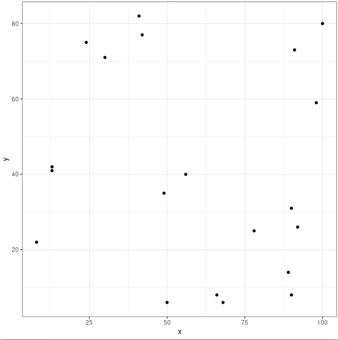
Let’s simulate some data using R and the sample() function. The sample() samples random numbers from a vector or elements, x, and one can allow for the same numbers to be selected more than once replace = TRUE or not (FALSE).
set.seed(123)
df <- tibble(
  id = 1:20,
  x  = sample(x = 0:100, size = 20, replace = TRUE),
  y  = sample(x = 0:100, size = 20, replace = TRUE)
)
df

# A tibble: 20 × 3
      id     x     y
   <int> <int> <int>
 1     1    30    71
 2     2    78    25
 3     3    50     6
 4     4    13    41
 5     5    66     8
 6     6    41    82
 7     7    49    35
 8     8    42    77
 9     9   100    80
10    10    13    42
11    11    24    75
12    12    89    14
13    13    90    31
14    14    68     6
15    15    90     8
16    16    56    40
17    17    91    73
18    18     8    22
19    19    92    26
20    20    98    59
Because the numbers in the x and y columns are chosen randomly there should be no correlation between x and y. Let’s first plot the numbers to get a feel for what the two distributions look like:
ggplot(df, aes(x, y)) +
  geom_point() +
  theme_bw()
And to calculate rho using R:
cor.test(df$x, df$y, method = "pearson")
	Pearson's product-moment correlation

data:  df$x and df$y
t = -0.60281, df = 18, p-value = 0.5542
alternative hypothesis: true correlation is not equal to 0
95 percent confidence interval:
 -0.5490152  0.3218878
sample estimates:
       cor
-0.1406703
Here rho is -0.14 which is slightly negative (negative correlation, x and y tend to vary in opposite directions) but too close to zero to consider this a true correlation. Rules of thumb for Pearson’s rho are often:
+-0.1 = weak correlation
+-0.3 = medium correlation
+-0.5 = strong correlation
However, although this is useful these rules needs to be interpreted with caution. The cor.test also gives out a p-value, and a p-value of 0.55 in this case shows that the two variables are not correlated.
More realistic data with weights and heights of different people:
class <- tibble(
  ht_in = c(70, 63, 62, 67, 67, 58, 64, 69, 65, 68, 63, 68, 69, 66, 67, 65,
            64, 75, 67, 63, 60, 67, 64, 73, 62, 69, 67, 62, 68, 66, 66, 62,
            64, 68, NA, 68, 70, 68, 68, 66, 71, 61, 62, 64, 64, 63, 67, 66,
            69, 76, NA, 63, 64, 65, 65, 71, 66, 65, 65, 71, 64, 71, 60, 62,
            61, 69, 66, NA),
  wt_lbs = c(216, 106, 145, 195, 143, 125, 138, 140, 158, 167, 145, 297, 146,
             125, 111, 125, 130, 182, 170, 121, 98, 150, 132, 250, 137, 124,
             186, 148, 134, 155, 122, 142, 110, 132, 188, 176, 188, 166, 136,
             147, 178, 125, 102, 140, 139, 60, 147, 147, 141, 232, 186, 212,
             110, 110, 115, 154, 140, 150, 130, NA, 171, 156, 92, 122, 102,
             163, 141, NA)
)
Make a scatter plot to look at the relationship between weight and height:
ggplot(class, aes(ht_in, wt_lbs)) +
  geom_jitter() + # avoid overlapping points
  theme_classic()
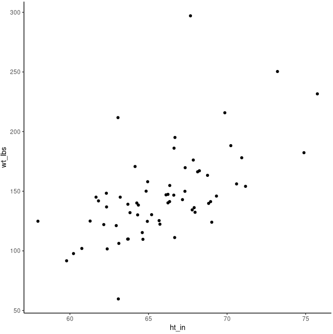
cor.test(class$ht_in, class$wt_lbs)
##
##  Pearson's product-moment correlation
##
## data:  class$ht_in and class$wt_lbs
## t = 5.7398, df = 62, p-value = 3.051e-07
## alternative hypothesis: true correlation is not equal to 0
## 95 percent confidence interval:
##  0.4013642 0.7292714
## sample estimates:
##       cor
## 0.5890576
Although the dots don’t line up perfectly, there’s clearly a positive trend that increasing height means increasing weight. We also see that rho is 0.58 which is a strong correlation. And the p-value is very small (3.051e-07), meaning that observing these relationships by random (if the true value of the correlation of the population from which our sample was drawn was zero - this is the null hypothesis) is extremely unlikely.
Let’s add a regression line to the plot which summarises the relationshop between the two variables. We can add geom_smooth() with the method lm (linear model) to add an Ordinary Least Squares regression line:
ggplot(class, aes(ht_in, wt_lbs)) +
  geom_smooth(method = "lm") +
  geom_jitter() +
  theme_classic()
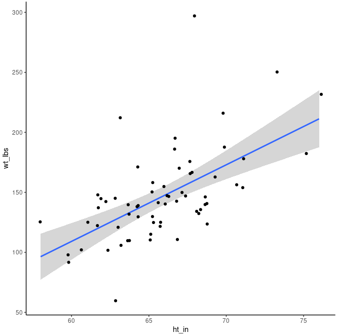
The regression line has an upward slope, meaning that on average as height increases weight will also increase. One can think of the regression line as cutting through the middle of all the points and representing the average change in the y value given a one-unit change in the x value. The shaded area around the regression line shows the 95% confidence interval (default) from the predictions of the model.
Continuous vs. categorical variable
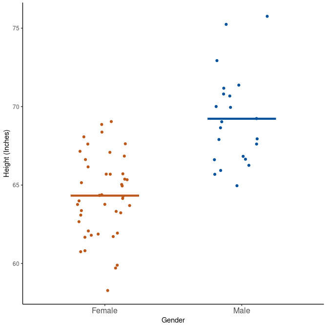
Earlier we looked at the overall mean of an entire dataset, like height. But if we want to compare height within gender we perform bivariate analysis of a continuous vs. categorical variable. In this case, we often use the mean of the continuous variable.
Using the same data as before:
class <- tibble(
  age       = c(32, 30, 32, 29, 24, 38, 25, 24, 48, 29, 22, 29, 24, 28, 24, 25,
                25, 22, 25, 24, 25, 24, 23, 24, 31, 24, 29, 24, 22, 23, 26, 23,
                24, 25, 24, 33, 27, 25, 26, 26, 26, 26, 26, 27, 24, 43, 25, 24,
                27, 28, 29, 24, 26, 28, 25, 24, 26, 24, 26, 31, 24, 26, 31, 34,
                26, 25, 27, NA),
  age_group = c(2, 2, 2, 1, 1, 2, 1, 1, 2, 1, 1, 1, 1, 1, 1, 1, 1, 1, 1, 1, 1,
                1, 1, 1, 2, 1, 1, 1, 1, 1, 1, 1, 1, 1, 1, 2, 1, 1, 1, 1, 1, 1,
                1, 1, 1, 2, 1, 1, 1, 1, 1, 1, 1, 1, 1, 1, 1, 1, 1, 2, 1, 1, 2,
                2, 1, 1, 1, NA),
  gender    = c(2, 1, 1, 2, 1, 1, 1, 2, 2, 2, 1, 1, 2, 1, 1, 1, 1, 2, 2, 1, 1,
                1, 1, 2, 1, 1, 2, 1, 1, 1, 2, 1, 1, 2, 2, 1, 2, 2, 1, 2, 2, 1,
                1, 1, 1, 1, 1, 1, 1, 2, 2, 1, 1, 1, 1, 2, 2, 1, 1, 2, 1, 2, 1,
                1, 1, 2, 1, NA),
  ht_in     = c(70, 63, 62, 67, 67, 58, 64, 69, 65, 68, 63, 68, 69, 66, 67, 65,
                64, 75, 67, 63, 60, 67, 64, 73, 62, 69, 67, 62, 68, 66, 66, 62,
                64, 68, NA, 68, 70, 68, 68, 66, 71, 61, 62, 64, 64, 63, 67, 66,
                69, 76, NA, 63, 64, 65, 65, 71, 66, 65, 65, 71, 64, 71, 60, 62,
                61, 69, 66, NA),
  wt_lbs    = c(216, 106, 145, 195, 143, 125, 138, 140, 158, 167, 145, 297, 146,
                125, 111, 125, 130, 182, 170, 121, 98, 150, 132, 250, 137, 124,
                186, 148, 134, 155, 122, 142, 110, 132, 188, 176, 188, 166, 136,
                147, 178, 125, 102, 140, 139, 60, 147, 147, 141, 232, 186, 212,
                110, 110, 115, 154, 140, 150, 130, NA, 171, 156, 92, 122, 102,
                163, 141, NA),
  bmi       = c(30.99, 18.78, 26.52, 30.54, 22.39, 26.12, 23.69, 20.67, 26.29,
                25.39, 25.68, 45.15, 21.56, 20.17, 17.38, 20.8, 22.31, 22.75,
                26.62, 21.43, 19.14, 23.49, 22.66, 32.98, 25.05, 18.31, 29.13,
                27.07, 20.37, 25.01, 19.69, 25.97, 18.88, 20.07, NA, 26.76,
                26.97, 25.24, 20.68, 23.72, 24.82, 23.62, 18.65, 24.03, 23.86,
                10.63, 23.02, 23.72, 20.82, 28.24, NA, 37.55, 18.88, 18.3,
                19.13, 21.48, 22.59, 24.96, 21.63, NA, 29.35, 21.76, 17.97,
                22.31, 19.27, 24.07, 22.76, NA),
  bmi_3cat  = c(3, 1, 2, 3, 1, 2, 1, 1, 2, 2, 2, 3, 1, 1, 1, 1, 1, 1, 2, 1, 1,
                1, 1, 3, 2, 1, 2, 2, 1, 2, 1, 2, 1, 1, NA, 2, 2, 2, 1, 1, 1, 1,
                1, 1, 1, 1, 1, 1, 1, 2, NA, 3, 1, 1, 1, 1, 1, 1, 1, NA, 2, 1,
                1, 1, 1, 1, 1, NA)
) %>%
  mutate(
    age_group = factor(age_group, labels = c("Younger than 30", "30 and Older")),
    gender = factor(gender, labels = c("Female", "Male")),
    bmi_3cat = factor(bmi_3cat, labels = c("Normal", "Overweight", "Obese"))
  )
The easiest is just to use the same simple descriptive statistics as before, except that we apply these to each group of the categorical variable:
Single predictor and single outcome
class_summary <- class %>%
  filter(!is.na(ht_in)) %>% # Can also use na.rm = TRUE in the various functions inside summarise().
  group_by(gender) %>%
  summarise(
    n                    = n(),
    mean                 = mean(ht_in),
    `standard deviation` = sd(ht_in),
    min                  = min(ht_in),
    max                  = max(ht_in),
    range                = max(ht_in) - min(ht_in),
  ) %>%
  print()
## # A tibble: 2 × 6
##   gender     n  mean `standard deviation`   min   max range
##   <fct>  <int> <dbl>                <dbl> <dbl> <dbl> <dbl>
## 1 Female    43  64.3                 2.59    58    69    11
## 2 Male      22  69.2                 2.89    65    76    11
We see that makes are on average taller than females. But the spread seems to be quite equal within the two groups. They have the same range and similar SD. We can plot this also:
class %>%
  filter(!is.na(ht_in)) %>%
  ggplot(aes(x = gender, y = ht_in)) +
    geom_jitter(aes(col = gender), width = 0.20) +
    geom_segment(
      aes(x = c(0.75, 1.75), y = mean, xend = c(1.25, 2.25), yend = mean, col = gender),
      size = 1.5, data = class_summary
    ) +
    scale_x_discrete("Gender") +
    scale_y_continuous("Height (Inches)") +
    scale_color_manual(values = c("#BC581A", "#00519B")) +
    theme_classic() +
    theme(legend.position = "none", axis.text.x = element_text(size = 12))
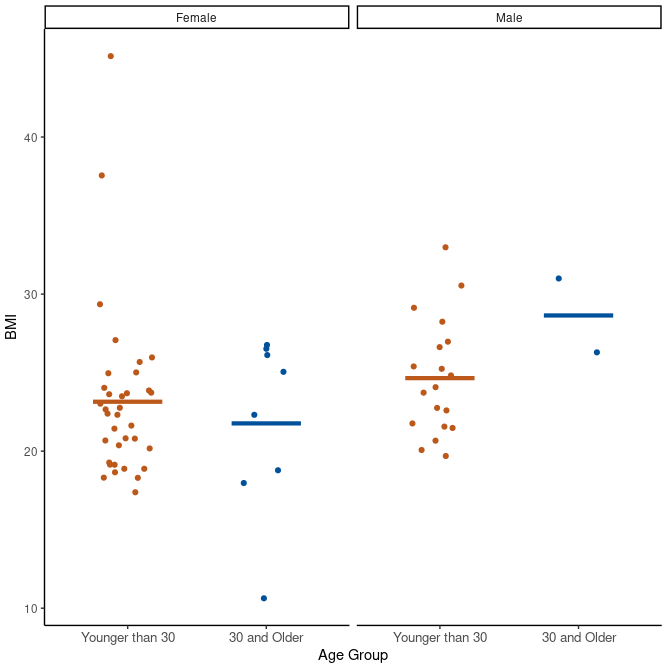
Multiple predictors
If we want to comparing continuous outomes across several levels or categorical variables. In our case this is easy as we can just add more variables to the group_by() function:
class_summary <- class %>%
  filter(!is.na(bmi)) %>%
  group_by(gender, age_group) %>%
  summarise(
    n                    = n(),
    mean                 = mean(bmi),
    `standard deviation` = sd(bmi),
    min                  = min(bmi),
    max                  = max(bmi)
  )

class_summary
## # A tibble: 4 × 7
## # Groups:   gender [2]
##   gender age_group           n  mean `standard deviation`   min   max
##   <fct>  <fct>           <int> <dbl>                <dbl> <dbl> <dbl>
## 1 Female Younger than 30    35  23.1                 5.41  17.4  45.2
## 2 Female 30 and Older        8  21.8                 5.67  10.6  26.8
## 3 Male   Younger than 30    19  24.6                 3.69  19.7  33.0
## 4 Male   30 and Older        2  28.6                 3.32  26.3  31.0
Here we investigate bmi separately for males and females in different age groups.
class %>%
  filter(!is.na(bmi)) %>%
  ggplot(aes(x = age_group, y = bmi)) +
    facet_wrap(vars(gender)) +
    geom_jitter(aes(col = age_group), width = 0.20) +
    geom_segment(
      aes(x = rep(c(0.75, 1.75), 2), y = mean, xend = rep(c(1.25, 2.25), 2), yend = mean,
          col = age_group),
      size = 1.5, data = class_summary
    ) +
    scale_x_discrete("Age Group") +
    scale_y_continuous("BMI") +
    scale_color_manual(values = c("#BC581A", "#00519B")) +
    theme_classic() +
    theme(legend.position = "none", axis.text.x = element_text(size = 10))
Leave a Comment